


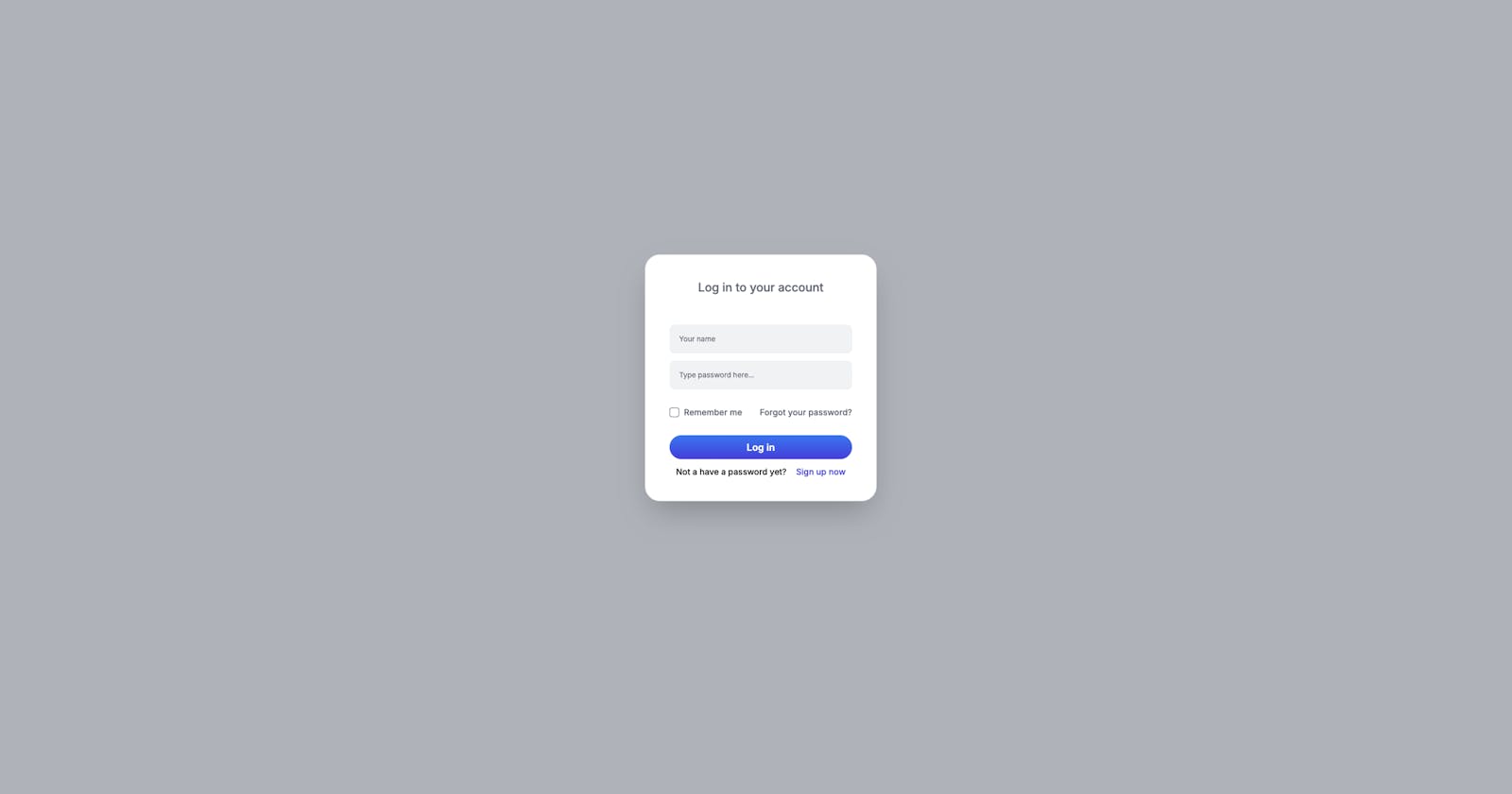
In this tutorial, we'll be crafting a login modal component using Tailwind CSS and Alpine.js, including a smooth slide-up animation from the bottom to enhance the aesthetic of your website.
The wrapper
x-data="{ open: false }"*: This directive initializes a new AlpineJS component and declares a reactive data object with a property namedopen. Initially,openis set tofalse, indicating that the modal is not visible by default. This property is used to control the visibility of the modal dialog. When the trigger button is clicked, open will be set totrue, causing the modal to display.
Trigger Button
HTML Element*:<span>containing a<button>Functionality*: Clicking the button setsopentotrue, which triggers the modal to open.Styling*: Uses Tailwind CSS for dimensions, colors, typography, and transitions. It has responsive styles for larger screens with2xl:prefix.
Modal Dialog
HTML Element*:<div>withrole="dialog"Functionality*:Controlled by the
openstate inx-data.Closes when the escape key is pressed, using
x-on:keydown.escape.Uses
x-idto associate the modal with an accessible label.
Styling*: Positioned fixedly over the entire viewport, with a z-index ensuring it appears above other content.fixed*: Positions the modal relative to the viewport, meaning it will always stay in the same place even if the page is scrolled.inset-0*: This is shorthand for settingtop,right,bottom, andleftpositions to 0. It stretches the modal to cover the entire viewport.z-50*: Sets the z-index of the modal to50. This is used to control the stacking order of positioned elements, ensuring the modal sits above most other elements on the page.w-screen*: Ensures the modal has a width equal to the width of the viewport, making it span across the entire screen width.overflow-y-hidden*: Prevents vertical scrolling within the modal. This is useful for ensuring that the modal overlay itself does not scroll, which can be important for modals that are intended to lock the background content from scrolling.
<div
  x-show="open"
  role="dialog"
  aria-modal="true"
  style="display: none;"
  x-id="['modal-title']"
  aria-labelledby="modal-title-3"
  :aria-labelledby="$id('modal-title')"
  x-on:keydown.escape.prevent.stop="open = false"
  class="fixed inset-0 z-50 w-screen overflow-y-hidden"
  >
  <!-- Modal content --->
</div>
Overlay
x-show="open"*: This AlpineJS directive controls the visibility of the overlay based on theopenstate variable. The overlay is only displayed (display: block;) when open istrue, and hidden (display: none;) when open is false.x-transition.opacity*: An AlpineJS transition directive that applies an opacity transition effect when the overlay is shown or hidden. This enhances the user experience by providing a smooth transition into and out of visibility, rather than a sudden change.fixed*: This class applies a fixed position to the overlay, anchoring it to the viewport. It ensures that the overlay will cover the entire screen, regardless of the scrolling position, by removing it from the normal document flow and positioning it relative to the viewport.inset-0: This utility applies values of 0 to
top,right,bottom, andleftproperties simultaneously. It stretches the overlay to cover the entire viewport, ensuring no part of the underlying content is visible around the edges of the overlay.bg-gray-500*: Sets the background color of the overlay to a medium shade of gray (gray-500 in the Tailwind CSS color palette). This choice of color serves to moderately darken the screen, helping to reduce the visual prominence of the background content behind the modal dialog.bg-opacity-50*: Adjusts the opacity of the background color to 50%. This creates a semi-transparent effect, allowing the underlying page content to be subtly visible through the overlay. The semi-transparency helps maintain context for the user, indicating that the modal is an intermediate layer above the original content, without completely obscuring it.
<div
  x-show="open"
  x-transition.opacity=""
  style="display: none;"
  class="fixed inset-0 bg-gray-500 bg-opacity-50"
  >
</div>
Modal Panel
Alpine.js Directives:
x-show="open": Controls the visibility of the modal based on the boolean value of theopenstate. Ifopenis true, the modal is displayed; otherwise, it is hidden.x-on:click="open = false": This directive attaches a click event listener to the modal overlay. Clicking the overlay sets theopenstate to false, which closes the modal.x-transitionDirectives: These directives manage the animation for the modal entering and leaving the view:x-transition:enter="transition ease-out duration-300": Starts the entering transition with an ease-out timing function over 300 milliseconds.x-transition:enter-start="transform opacity-0 translate-y-full": At the start of entering, the modal is fully transparent and positioned off-screen at the bottom.x-transition:enter-end="transform opacity-100 translate-y-0": At the end of entering, the modal is fully opaque and transitions to its original position.x-transition:leave="transition ease-in duration-300": Applies an ease-in transition effect over 300 milliseconds when the modal begins to close.x-transition:leave-start="transform opacity-100 translate-y-0": At the start of leaving, the modal is fully opaque and in its original position.x-transition:leave-end="transform opacity-0 translate-y-full": At the end of leaving, the modal becomes fully transparent and moves down off-screen.
Tailwind CSS Classes:
The modal uses the following Tailwind CSS classes for styling and layout:
class="relative flex min-h-screen items-center justify-center p-4":relative: Positions the modal relative to its normal flow, enabling z-index and other positioning utilities to be effective.flex items-center justify-center: These Flexbox utilities center the modal content both vertically and horizontally within the viewport.min-h-screen: Ensures that the modal's minimum height is equal to the height of the viewport, aiding in the vertical centering of the modal.p-4: Adds padding of 1rem on all sides of the modal content, providing spacing between the modal content and the edges of the modal container.
<div
  x-show="open"
  style="display: none;"
  x-on:click="open = false"
  x-transition:leave="transition ease-in duration-300"
  x-transition:enter="transition ease-out duration-300"
  x-transition:enter-end="transform opacity-100 translate-y-0"
  x-transition:leave-end="transform opacity-0 translate-y-full"
  x-transition:leave-start="transform opacity-100 translate-y-0"
  x-transition:enter-start="transform opacity-0 translate-y-full"
  class="relative flex min-h-screen items-center justify-center p-4"
  >
  <!-- Content -->
</div>
Close Mechanism
The modal can be closed by:
Clicking outside the modal content.
Pressing the escape key.
Adding a close button with
x-on:click="open = false"
This structure and styling ensure a responsive, accessible, and aesthetically pleasing modal component suitable for various applications, particularly for login functionalities.
The modal content wrapper
The modal content wrapper serves as the container for all the content displayed within the modal. It uses a combination of Alpine.js directives for enhanced functionality and Tailwind CSS classes for styling.
Alpine.js Directives
x-on:click.stop="": This directive stops the click event from propagating further. It's essential in a modal context to prevent clicks within the modal from closing it if there's anx-on:clickhandler on the overlay designed to hide the modal on click.x-trap.noscroll.inert="open": When the modal is open, this directive traps the focus within the modal and optionally disables scrolling on the body, enhancing accessibility and user experience.
Tailwind CSS Classes
relative: Positions the element relative to its normal position, which is crucial for positioning elements inside it or applyingz-index.overflow-y-auto: Allows vertical scrolling within the element if the content exceeds the element's height, ensuring all content is accessible.
<div
  x-on:click.stop=""
  x-trap.noscroll.inert="open"
  class="relative w-full max-w-sm overflow-y-auto shadow-2xl bg-white ring-1 ring-gray-200 rounded-3xl p-10">
  <!-- Your modal's content go here-->
</div>
The full code
<div
  class="flex justify-center"
  x-data="{ open: false }">
  <!-- Trigger -->
  <span x-on:click="open = true">
    <button
      type="button"
      class="flex items-center 2xl:text-xl 2xl:h-12 justify-center h-10 px-4 py-2 text-base font-semibold text-white transition-all duration-200 rounded-full bg-gradient-to-b from-blue-500 to-indigo-600 hover:to-indigo-700 shadow-button shadow-blue-600/50 focus:ring-2 focus:ring-blue-950 focus:ring-offset-2 ring-offset-gray-200 hover:shadow-none">
      Log in
    </button>
  </span>
  <!-- Modal -->
  <div
    x-show="open"
    role="dialog"
    aria-modal="true"
    style="display: none;"
    x-id="['modal-title']"
    aria-labelledby="modal-title-3"
    :aria-labelledby="$id('modal-title')"
    x-on:keydown.escape.prevent.stop="open = false"
    class="fixed inset-0 z-50 w-screen overflow-y-hidden">
    <!-- Overlay -->
    <div
      x-show="open"
      x-transition.opacity=""
      style="display: none;"
      class="fixed inset-0 bg-gray-500 bg-opacity-50">
    </div>
    <!-- Panel -->
    <div
      x-show="open"
      x-on:click="open = false"
      x-transition:enter="transition ease-out duration-300"
      x-transition:enter-start="transform opacity-0 translate-y-full"
      x-transition:enter-end="transform opacity-100 translate-y-0"
      x-transition:leave="transition ease-in duration-300"
      x-transition:leave-start="transform opacity-100 translate-y-0"
      x-transition:leave-end="transform opacity-0 translate-y-full"
      class="relative flex min-h-screen items-center justify-center p-4"
      style="display: none;">
      <div
        x-on:click.stop=""
        x-trap.noscroll.inert="open"
        class="relative w-full max-w-sm overflow-y-auto shadow-2xl bg-white ring-1 ring-gray-200 rounded-3xl p-10">
        <!-- Your modal's content go here, like the log in form on this case -->
      </div>
    </div>
  </div>
</div>
In conclusion, mixing Tailwind CSS and Alpine.js for that smooth slide-up effect. It's all about making your site look good and work smoothly. Happy coding!