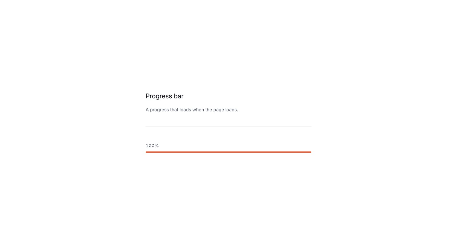
How to create a progress-bar with Tailwind CSS and AlpinejsMichael Andreuzza·Apr 12, 2024·1 min readA progress bar, that's what we are going to build. Read the article See it live and get the code Tailwind CSSTailwind CSS TutorialalpinejsAstro Share this